Klaassen & Magnus's 22 Myths of Tennis - Myth 10
After two close semifinals, World No. 2 Andy Murray is set to defend his Madrid Masters title against top seed Novak Djokovic. The fact that the two go into the match at the top of the ATP rankings leaderboard suggests that we are in store for a quality match, with Djokovic being the perennial favorite.
But what exactly does the difference of one position in ranking really tell us about the expected quality of play? The Madrid semifinal that pitted Djokovic against World No. 6 Kei Nishikori involved a difference of 5 positions in the ranking, while Murray’s semifinal against World No. 5 Rafael Nadal was a difference of just 3 ranking positions. Would it have been correct to expect, just with this information alone, that the Murray-Nadal match would be closer than Djokovic-Nishikori?
What is central to these questions is the information player ratings convey about a player’s quality and how quality scales as ratings increase. This topic also happens to be the focus of Klaassen and Magnus’s 10th tennis myth.
Myth 10: “Quality is a pyramid”
Myth 10 is a bit unlike any of the other myths of Analyzing Wimbledon. While the others have usually taken some often-heard tennis axiom and put it through a crucible of data analysis, the idea that “quality is a pyramid” isn’t one we have probably ever heard.
So what exactly are K&M getting at?
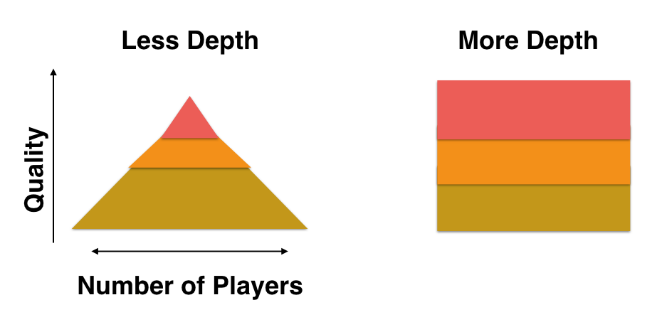
Suppose we take ranking points as our measure of quality. To see the “pyramid”, we at the very top of the ranking-points ladder, where Djokovic currently sits with 15,550 points, and move down in equal steps of 500, counting the number of players whose rating points fall within the current rung of ranking points. As we went along, our counts would initially be very small but they would get bigger as we went lower in the rankings. And if we were to plot the ranking point as the height and the number of players in the rung of the points as the width, we would end up—so K&M argue—with a shape like the pyramid on the left in the diagram above.
The key thing about the pyramid is that it tells us that quality doesn’t scale linearly with a player’s ranking position. If it did scale linearly, it would mean that equal difference in rankings would imply an equal difference in the quality of players. Djokvoic and Marin Cilic are currently separated by 10 ranking positions. If quality scaled linearly with ranking position, this would imply that the difference in quality of Djokovic and Cilic was equal to the difference between the 100th ranked player in the world (Albert Montanes) and the 111th (Yuichi Sugita). In reality, rather than staying equal, differences in quality get narrower and narrower as we step down the ranking ladder.
After making this point, K&M discuss a transformation of rankings that scales linearly with quality. Why search for such a thing? It turns out that statisticians like straight lines as much as a driver taking a sobriety test. So K&M wanted to find a form of ratings that would have a linear relationship to the probability of winning a point on serve. They came up with the “expected round” transformation, which is just a log base 2 of the ranking differences between two opponents. Sounds complicated, but it makes sense when you consider that tennis tournaments are designed to knockout half of the lowest ranked players in each round.
Revisiting Myth 10
One of the takeaways from K&M’s discussion on “quality as a pyramid” is that we can learn something about the depth of the tour by looking at the shape of how raking points scales with the number of ranked players. For example, if we contrast the pyramid with the square shape in the diagram above, the pyramid implies less depth as would happen in years when a few players might dominate the tour and quality declines sharply as you go down the ranking points ladder. A square would be the other extreme, where no one player dominates but you have a fairly equal and large group of players at each level of quality.
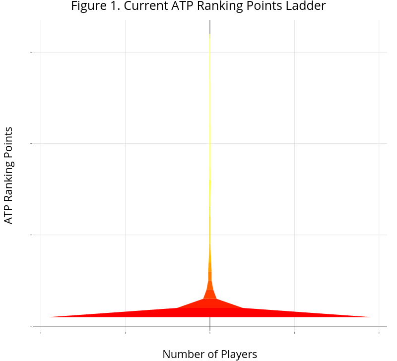
We don’t usually look at ranking points in this way, but doing so can give us some insight about the tour depth. The graph below shows ranking points against the player population size for steps of 500 ranking points. We see that the current quality versus ranked player relationship is even more extreme than a pyramid. The extent to which Djokovic and other top players have pulled away from the rest of the tour creates a shape that looks more like the base of a wine glass.
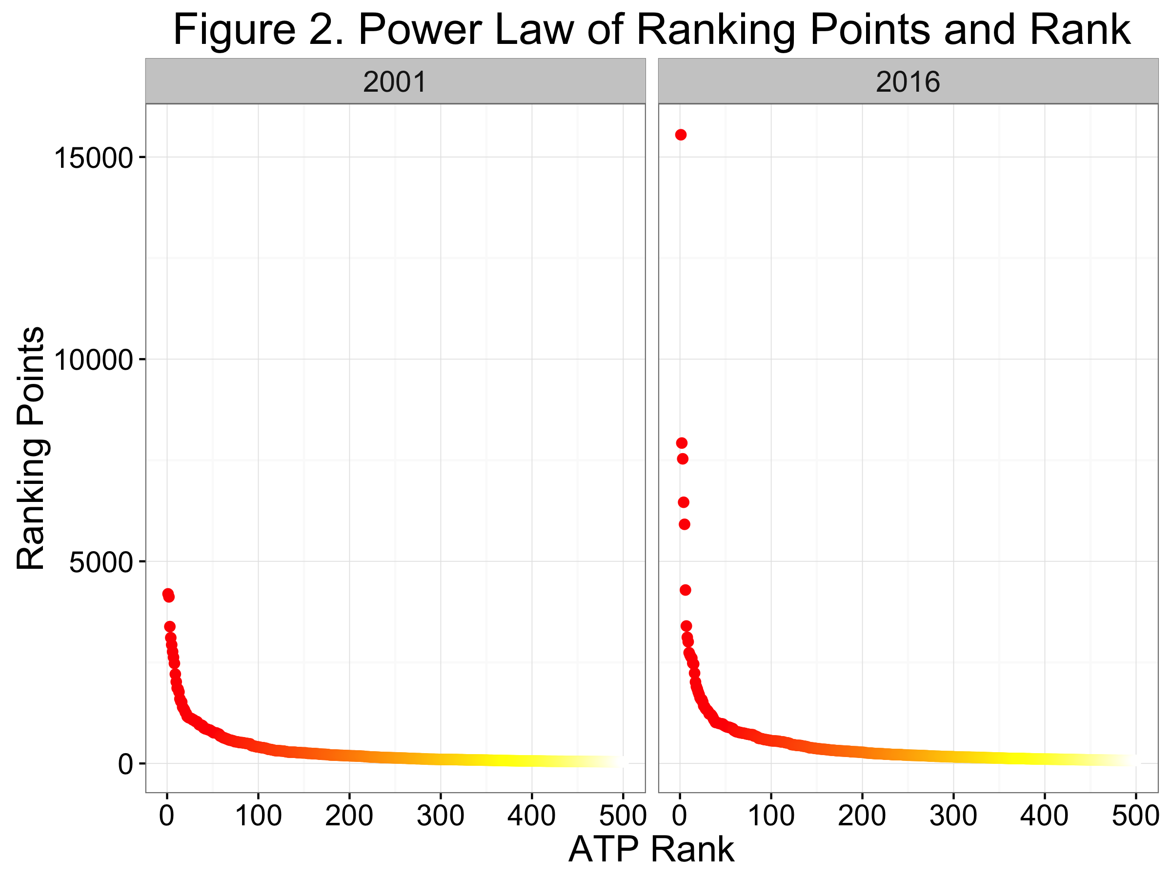
The above plot counts the number of players falling within equally-sliced sections of the rankings ladder. If we instead plot ranking points against player ranking directly, we see something that looks like a well-known functional form. Figure 3 shows the relationship for the current top 500 and for the top 500 in 2001, when Gustavo Kuerten was the World No. 1. The sharp drop as we go from left to right along the x-axis (highest to lowest rank players) and the long tail off to right is the characteristic shape of the Power Law distribution.
The power law arises whenever a relative change in one quantity is proportionally related to relative change in some explanatory variable. In the case of quality and rank, this means
$$ \mbox{Quality} = \alpha (Rank) ^{-\theta} $$
provides a good approximation to the quality-rank relationship. Sports rating systems aren’t special in this regard. The power law is actually one of the most ubiquitous mathematical relationships observed in the natural world and appears to be a good fit for all kinds of relationships from earthquake sizes to income distribution.
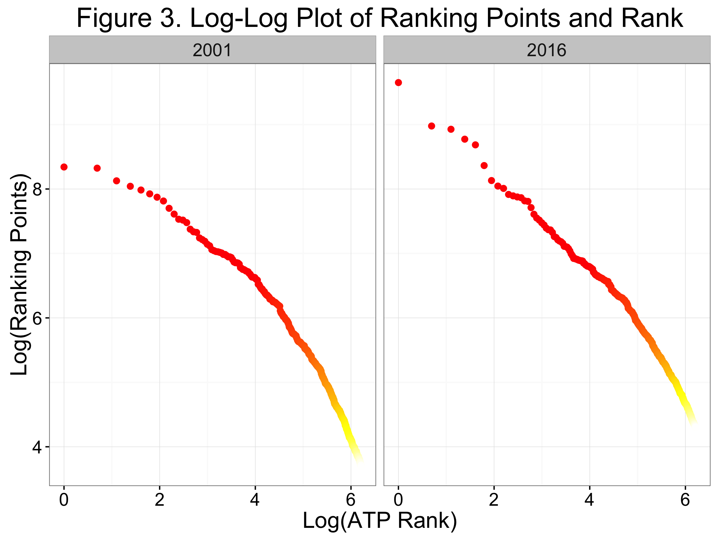
Identifying the power law form gives us some guess at how we could go about quantifying the depth or “pyramidness” of the tour at any particular time. Using the log-log plot, the power law says we can obtain that ever-desirable linear relationship between quality and rank In this case, the slope gives us the exponent term ($\theta$ above), which corresponds to the tour depth.
Because 2001 was a time in the recent past when the tour was in something of a transition period—the end of the Samprass-Agassi era and before Federer asserted his place in tennis history—we might expect this to be a good test year against periods where the tour is dominated by small number of players. Figure 3 shows the log-log version of the power law relationship for 2001 and 2016. We see a steeper slope in the current year, especially among the highest-ranked players where the curve looks almost flat for 2001.
So perhaps quality is better described as a power law than a pyramid.
Measuring Quality
In all of this discussion, I have used ranking points as the proxy for quality. We could have a whole other (and much longer) discussion about the problems with treating ranking points or rankings as a measure of player quality and many alternatives that do a better job (don’t think the new ATP Stats Leaderboards will be a solution, BTW). Still,whether we measure quality with a simple percentage of matches won in a season or some more complex rating like Elo, the survival-of-the-fittest nature of tennis suggests the power law will hold sway.