Assessing the Fit of a Serve Prediction Model
A model that could predict a player’s performance on serve would have a number of interesting uses like forecasting the outcome of matches or identifying surprising performances. But for any of these uses the model would need to be accurate and reliable. How should we evaluate a model’s performance? And how do we know when a model is good enough?
My last post looked at one model for estimating a player’s expected win probability against a specific opponent: the Barnett and Clarke model. The key strength of the model is that it goes some way to account for the server-receiver interplay. In mathematical terms, the expectations on serve are the sum of the average player’s serve ability, the server of interest’s average performance difference from the average server, and the receiver’s average performance difference from the average receiver. I say ‘some way’ because the ‘average from average’ means the model ignores possible matchup effects, where, for example, a server might not play to their average against certain opponents owing to a style or some other clash.
We might wonder whether a model like this is an oversimplification. Does it actually represent the performance of players from one match to the next reasonably well?
For a model we want to use to predict future serve performances, we ultimately will want to test it with data the model has never seen. This is external (or out-of-sample) testing. But before we get to that point, we should first see if it provides a good description of the data it was built on. This is goodness-of-fit. There is no point in attempting a validation if the model fit is off.
Assessing model fit is one of the areas where the advantages of Bayesian models really shine. I showed last week how we can construct and get predictive distributions from a Bayesian version of the Barnett and Clarke model. A similar approach can also be a tool for gauging the fit of the model.
Let’s take an example with one player. I have fit the hierarchical serve model for WTA data for 2015 and 2016. In this example, I am going to pull out the serve performances for 142 of Angelique Kerber’s matches in that period.
Are the model estimates consistent with her performances in those matches?
To examine that we can perform a posterior predictive check. First, we sample a large number of expected serve probabilities against a specific opponent using the posterior distribution of the population, server, and receiver effects. For each match, we then look at how many points on serve Kerber actually played, say $n$, and draw samples from a Binomial distribution for the number of points won out of $n$ points served for all of the posterior samples. This then reflects the uncertainty due to the $n$ of the match.
The chart below groups each distribution by the opponent she faced in 2015-2016. Every vertical line is Kerber’s actual serve performance in one match against the opponent. With this joy plot, we can visually assess the fit of the model. A good fit is where the majority of observed points is within the denser regions of the distribution. When we see observed values falling way outside of the center of the distribution, it suggests a lack of fit.
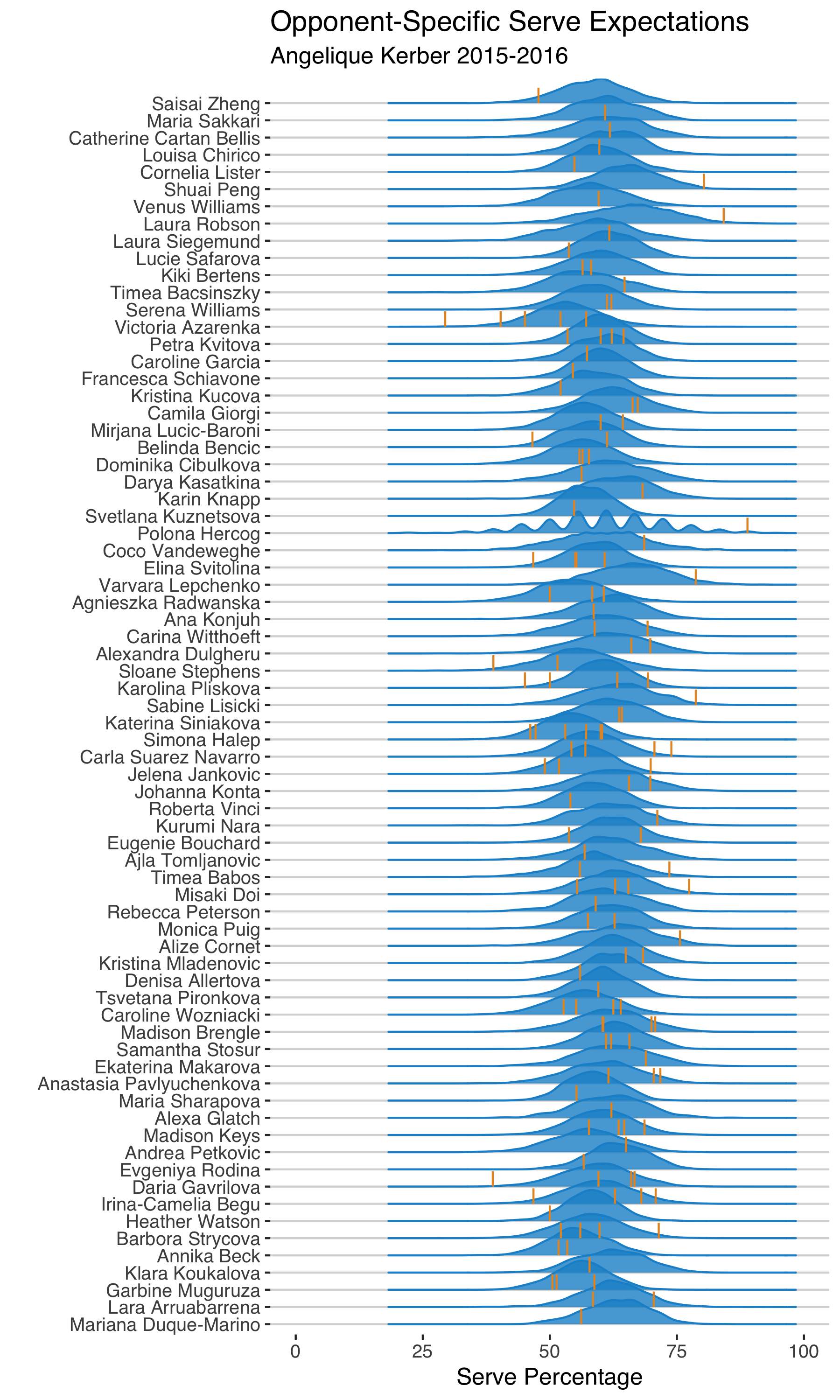
Take her curve against Petra Kvitova. There are 4 matches in the 2015-2016 model sample between Kerber and Kvitova. In those matches, Kerber’s serve performance ranged from 53% to 65%, which are all well within the range of the posterior distribution.
Contrast that with her match against Laura Robson. Kerber served a massive 84% in that match, which was much higher than the high-end of the tail of her posterior prediction. So possibly a model miss in this case1.
Scanning these plots, there are a few examples like the Robson case (Saisai Zheng and Corenlia Lister, for example). And one thing we notice is that most of them are cases where Kerber had a single match against them. This could be a clue that the model might not be handling players with fewer matches in the sample well.
Although the visual posterior predictive check can help to see some general patterns, we can’t just rely on eyeballing to diagnose the model. A more concise summary puts the focus on the frequency of extreme misses, what we should worry the most about. What I like to look at for this is the posterior predictive ‘discrepancy’. The discrepancy measure is simply how often we would expect to see a value less extreme than the observed value, according to the posterior predictive distribution. If that number is big, it means the model predictions aren’t capturing the observed result well.
The nice thing with the discrepancy is that it can act like a residual, in the sense that we get one number per observation that tells us about how different the model expectations are from the observed. When we plot that from most different to least we get something that looks a bit like a scree plot, what we could call a discrepancy scree plot.
There is a cluster of observations at the high end of the discrepancy scale. The question is whether this is too much to be a concern? And this is where we have to consider how we plan to use the model. If we are going to use it for ranking the mean serve performance of players over a season our goals for model fit might be less stringent than if we are going to use the model for integrity monitoring, for example.
Let’s say I want to use the model to identify surprising match performances. The current estimates for Kerber suggest that about 1 of every 10 matches would be outside the 5% most extreme values of the distribution. This wouldn’t be as reliable as I would want for this kind of application.
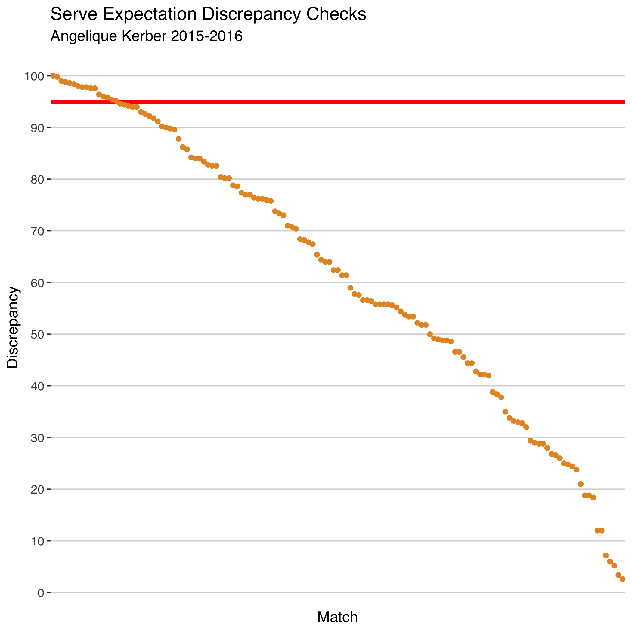
The useful thing about the discrepancy chart is that it gives us a way to easily filter out those outlying cases to see if there is something systematic about the opponents or matches. One thing that stands out in the extreme cluster for Kerber, for example, is that four of those matches were grass events. This might suggest player-specific surface adjustments could reduce the discrepancy of the model for some servers.
It is just a small example but I hope this illustration shows how we can create visual checks of model fit that can help guide further model tuning. The back and forth of model vision and model diagnosis is a natural cycle, but we also have to be careful to avoid overfitting. This is where testing against new data becomes so crucial. And these are two issues I will have more to say about in a future post!
-
You might have also noticed the strange shape of the posterior predictive distribution against Polona Hercog at the 2016 US Open. Kerber had only 18 point on serve in this match as Hercog retired early in the second set. This shows the importance of conditioning on the sample size of points served in the match and also suggests we should drop retirements entirely. ↩︎