Measuring Match Fatigue
A talk at the recent New England Symposium on Statistics in Sport (NESSIS) made me wonder whether we can observe player fatigue in tennis matches? and how?
Several weeks ago, I was fortunate to attend the 10th NESSIS conference and enjoy a full program of sports statisticians presenting on a variety of research topics. One of the talks that especially caught my attention was given by Kyle Burris, a PhD student in statistics at Duke University, who presented a method he had developed for measuring fatigue of relief pitchers in Major League Baseball. (If you want to see the full talk between Division Series games, you can find it here
The basic idea behind Kyle’s approach was to think of fatigue as a cumulative phenomenon, which, with repeated tiring actions, results in a gradual decline in performance. The analogy he made— which seemed quite a compelling one to me— was to think of fatigue like an energy-sapping drug where the dose is some kind of competitive activity. No athlete wants to take such a drug, of course, but the idea is a useful one for thinking about how the fatigue/performance relationship could evolve and be modeled.
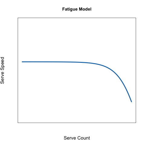
As with relief pitchers and pitching speeds, one would expect that greater fatigue in tennis would cause a decline in service speeds. The chart below gives a conceptual representation of how fatigue could manifest in service speeds. Here, the fatigue “dose” is measured by the number of serves a player has performed so far in a match.
But do effects like these exist at the elite level?
Few top players have had as many public struggles with fitness and injury so early in their career as Milos Raonic. This makes him a natural test case for a fatigue model.
After look over Raonic’s service data for his matches at the 2017 Australian Open, the fourth round match at Roberto Bautista Agut turned out to have an especially interesting pattern. Below are Raonic’s service times against his service count in that match (in KPH).
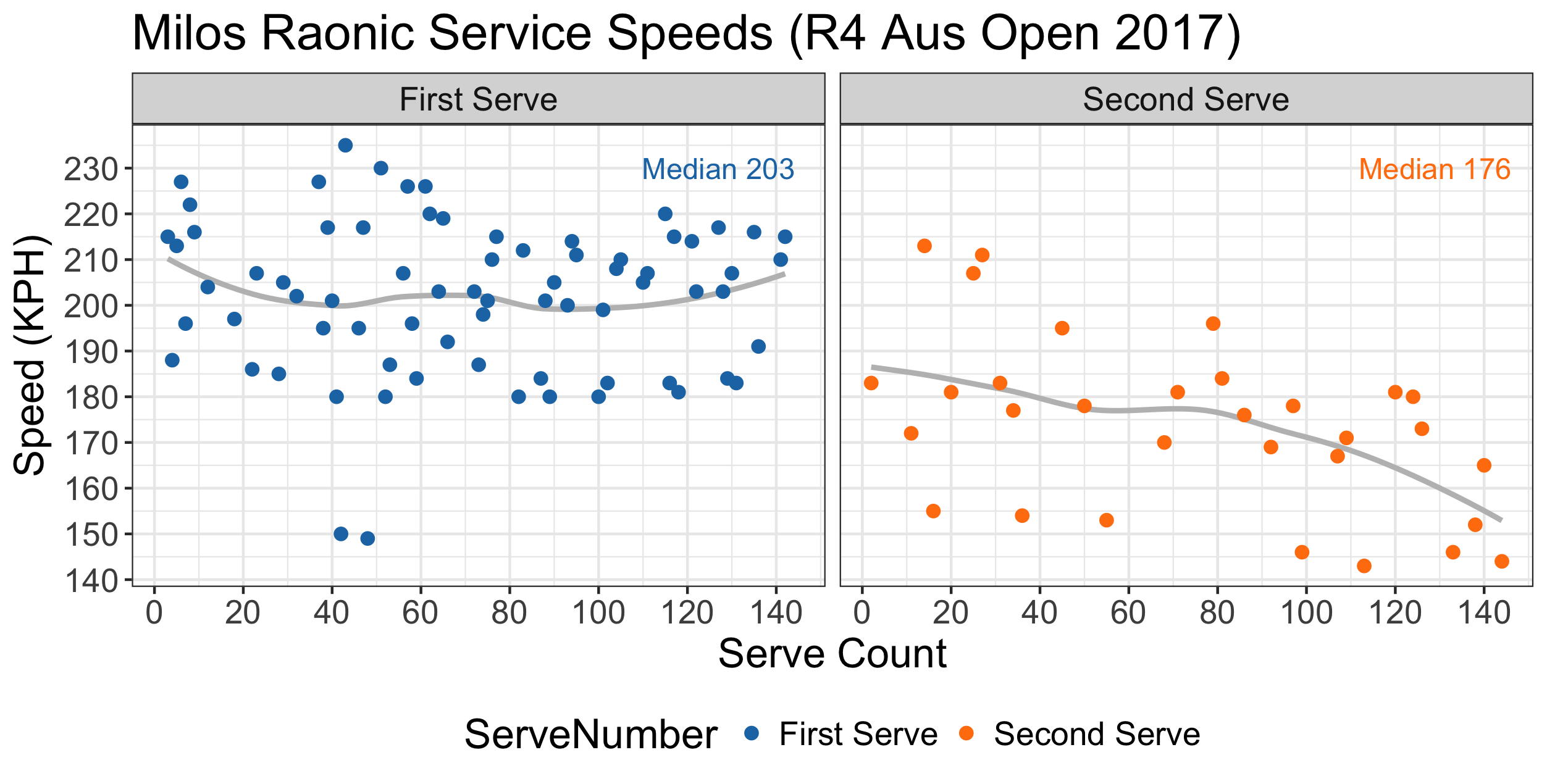
There are a few things we can observe from this chart. First, Raonic’s speeds on the first serve appeared relatively stable, with a few slow-paced outliers in the middle of the match, which could indicate a kind of “change up” serve. The second serves, on the other hand, show a suggestive decline.
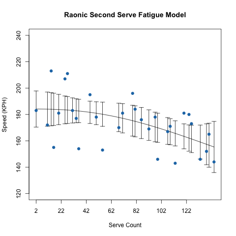
Focusing just on the second serves, we can look for evidence of fatigue by searching for a good fit among some standard dose-response models. These models are traditionally used to model a therapeutic response relative to a drug dose, and are highly non-linear in their form, the log-logistic being one of the most popular examples. In this case, we are applying the model to describe changes in speed with the serve count (our “dose”).
There is a really nice R package drc that makes does-response modeling quite accessible. I looked at several available models for a continuous response and found that a four-parameters log-logistic provided the best overall fit. The fatigue curve estimated by this model is shown below and clearly suggests a decline with increasing serve count.
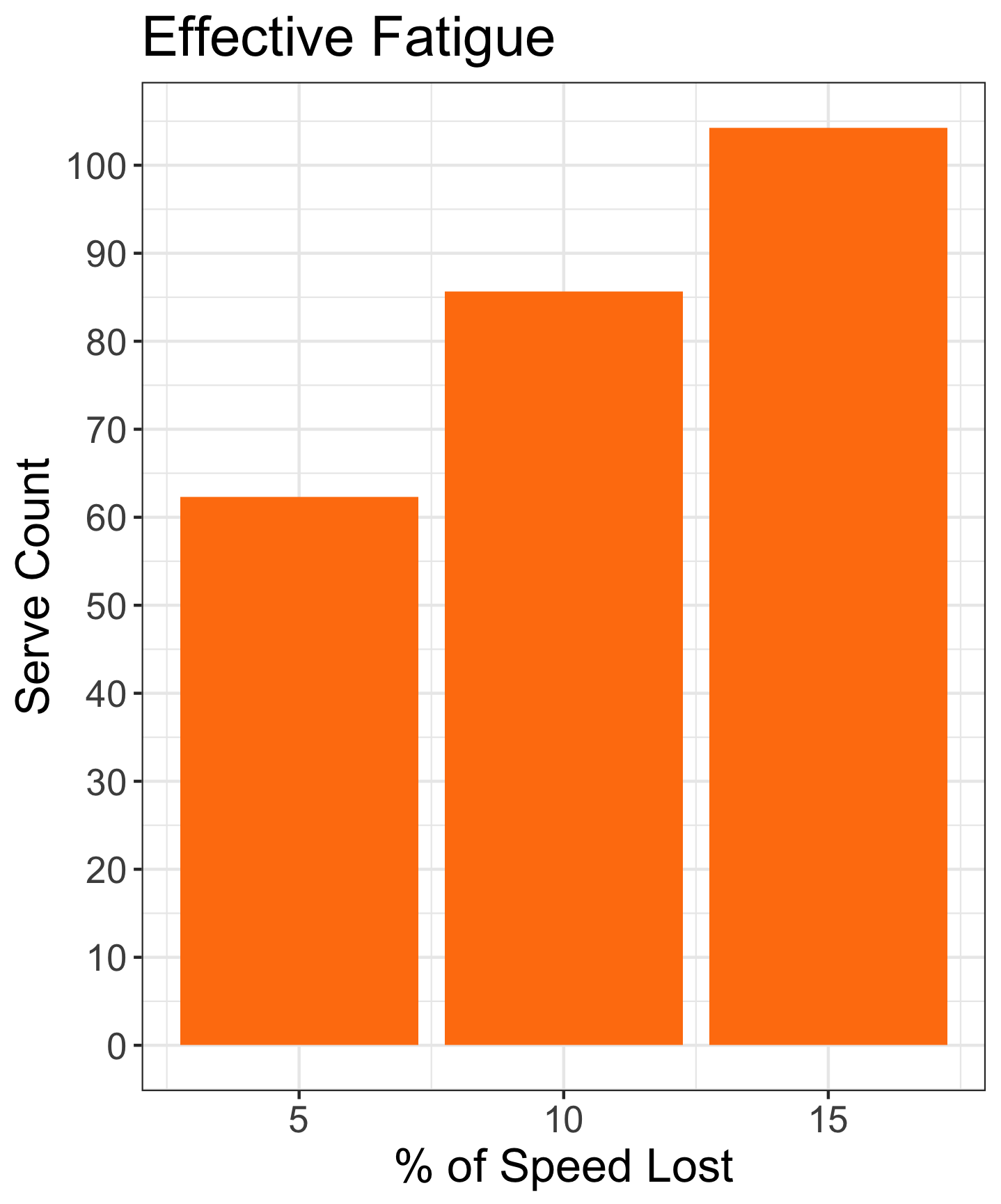
Decline in speed isn’t necessarily a bad thing if it is small (especially for a big server like Raonic). How can we judge a decline (i.e. fatigue effect) that might be of concern for a player’s performance?
There is no one correct answer here but one guideline I think is useful is to use the gap between a typical first and second serve as a reference point, as we know the effectiveness between these two service types are inarguably relevant. Most male serves drop about 15% in speed from the first to second.
The chart below shows the “effective fatigue” for a 5, 10, and 15% decline in initial service speeds (the first to second serve gap) implied by Raonic’s fatigue in the fourth round. The dose-response curve suggests that Roanic reached a decline of high concern by the 104th serve in the match.
This small case study suggests that there is some promising work to be done with fatigue modeling in tennis and looking at service speeds is a natural place to start.
One obvious question that this illustration does raise, however, is why, if what is happening in Raonic’s second serve is truly a fatigue effect, do we not observe the same on the first serve? I think a possible explanation of this has to do with the different serves a player might use on the first and second. A player will tend to go for a fast and flatter type of serve on the first, but use a spinner kick serve on the second. Because the mechanics involved with these two service types are quite different, they could exert a different energy cost and explain the different patterns observed by service number.
But this is just one possible guess and there is plenty left to delve into to better understand fatigue effects in tennis.
The code and data for this post can be found here.