Hardcourt First Return Impact Styles
Once we can measure player impact patterns on the return, it is natural to use these patterns to compare players. This post delves into these comparisons and presents a set of distinct impact types that describe the impact styles of top ATP players when returning the first serve on hardcourts.
I recently introduced the Return Impact Map: an interactive visualization tool for exploring the impact characteristics of receivers. That mapping tool is ideal for seeing the tendencies of individual players. However, focusing on individual players does not make it easy to see common tendencies across players or determine which players are more or less similar.
So, to complement the detailed views of the Return Impact Map, this post will present a summary of the distinct impact styles of top ATP players.
When I refer to ‘an impact style’, I am trying to get at an impact pattern that is representative of a group of players. This suggests that identifying a style is the same as finding players whose impact characteristics are similar in some sense.
Finding similar players starts by measuring the distance between each player’s impact characteristics. In any given situation a player’s impact is measured by the expected X and Y (depth and width) coordinate of the ball at impact, estimated from the plus-minus model used for the Return Impact Map.
On any surface, a player has 9 parameters describing the X and Y expected position for each court side and serve type. Lets use $\boldsymbol{\theta}_i = (\theta_{1}, \theta_{2}, \ldots)$ as the collection of these parameters for the $i$th player. We then standardize each element of $\boldsymbol{\theta}_i$ across players to have zero mean and standard deviation one, which will have the effect of giving each variable (whether depth or width) an equal contribution to our similarity measure. Call the standardized parameters $\bar{\boldsymbol{\theta}}_i$. The distance (or dissimilarity) between two players is the Euclidean distance between their standardized impact vectors,
$$ d(\bar{\boldsymbol{\theta}}_i, \bar{\boldsymbol{\theta}}_j) = \sqrt{\sum_{k} (\bar{\theta}_{ik} - \bar{\theta}_{jk})^2} $$
So a player that is 1 standard deviation deeper on all wide serves compared to the average would have a distance of $\sqrt{2}$ from a player with an impact vector equal to the average.
The distance measures are the inputs to most clustering algorithms. I’ve used hierarchical clustering to identify the distinctive groups of players based on the first return impact patterns on hardcourt. After plotting the change in the between-cluster and within-cluster variance for 2 to 12 clusters, I found that the increase in between-cluster variance showed a notable decline at 7 clusters. So, since an even number has some advantages for presentation, I’ve chosen 8 style groups to present here.
The chart in Figure 1 is a dendrogram summary of the between-player distances in impact characteristics. The colors represent the 8 style groups from the hierarchical clustering algorithm. The nodes and branches that emanate from the center of the plot are indicators of dissimilarity. Essentially, two players who are very different in their impact style will have more branches and nodes between them. This makes Federer more similar to Nick Kyrgios than Stan Wawrinka, for example.
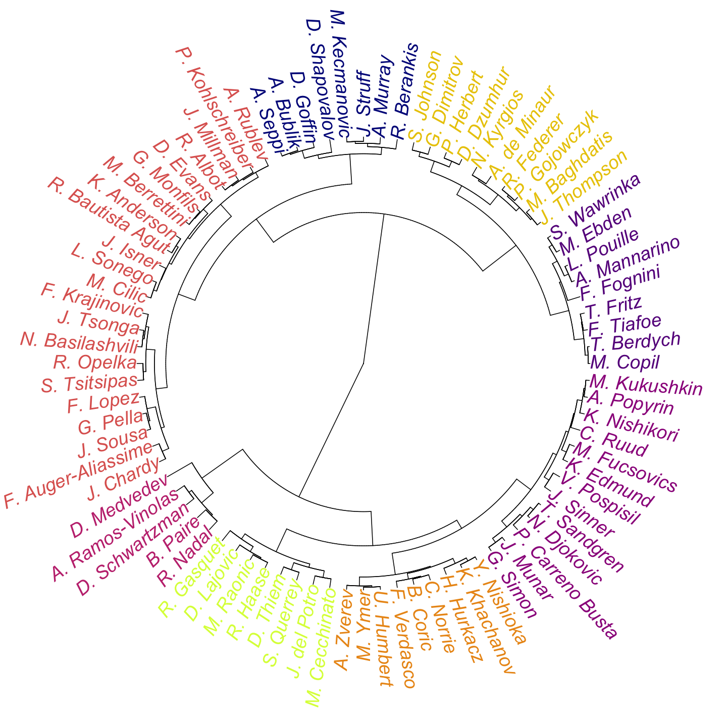
The group with Rafael Nadal and Daniil Medvedev has the fewest number of players, making it the most unusual among the 8 styles. Another interesting immediate takeaway is the number of left-handed players that cluster together. For instance, there is Feliciano Lopez and Guido Pella, in one group; Ugo Humbert and Fernando Verdasco, in another. Although handedness is not explicitly in the model, the player-specific tendencies show that there are some patterns (especially in the lateral position of players) that are more common among left-handed players.
The dendrogram gives us a nice overall summary of the similarity of impact styles among players. But to understand what each style actually represents, we have to go further. What makes one impact style distinctive from another?
The chart in Figure 2 tries to answer this question using a parallel coordinates display. Along the x-axis we have all of the 9 parameters that go into the impact summary. The y-axis is the standardized effect for the impact parameter. A value of zero is the average. Positive values in the X dimension are impacts that are at a deeper position than the average. Positive values in the Y dimension have a different interpretation depending on which court side, when to the Ad a positive value is a player positioned closer to the center, but it’s the reverse for the Deuce court.
To easily see each cluster, we give each its own panel. And the colors used are the same as the colors in the dendrogram, so you can match each player to each style panel. With this layout, we can immediately see that depth of impact is the most distinguishing set of characteristics across the style groups. Nadal’s style group 4 are the most defensive in their position, whereas Federer’s style group 7 are the most aggressive in their impact position.
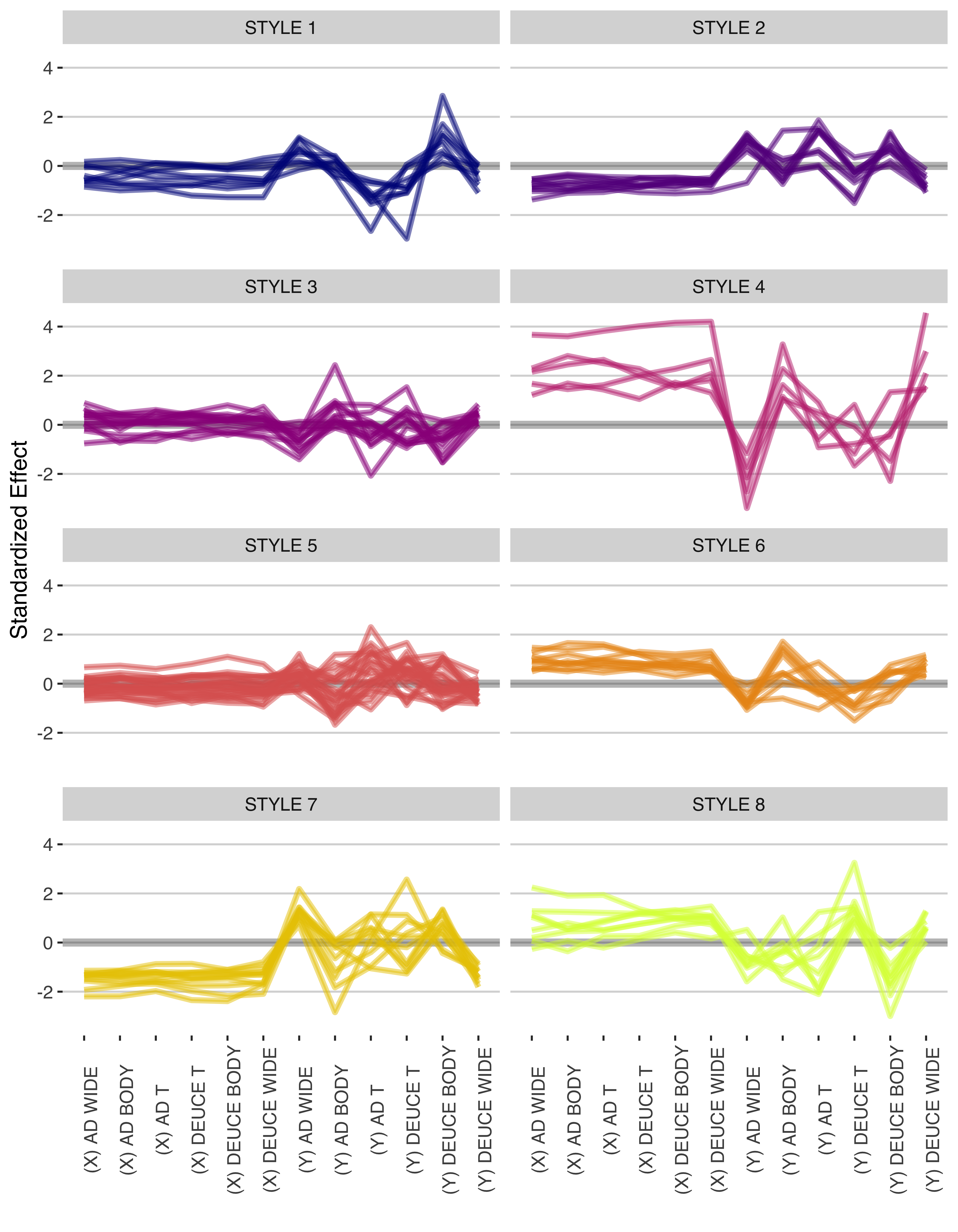
There is also some interesting patterns in the lateral position. The more defensively positioned players tend to be pulled out wider on impact when served out side. We can see this for style groups 4, 6 and 8. Although group 8 (which includes Thiem among it’s players) has some surprising patterns on the Deuce side, where player tend to be further from the center when making impact on T serves than most other players. Style group 1 also has an unusual pattern of being generally wider when making impact on T serves to the Ad but closer to the center line than average when seeing T serves to Deuce.
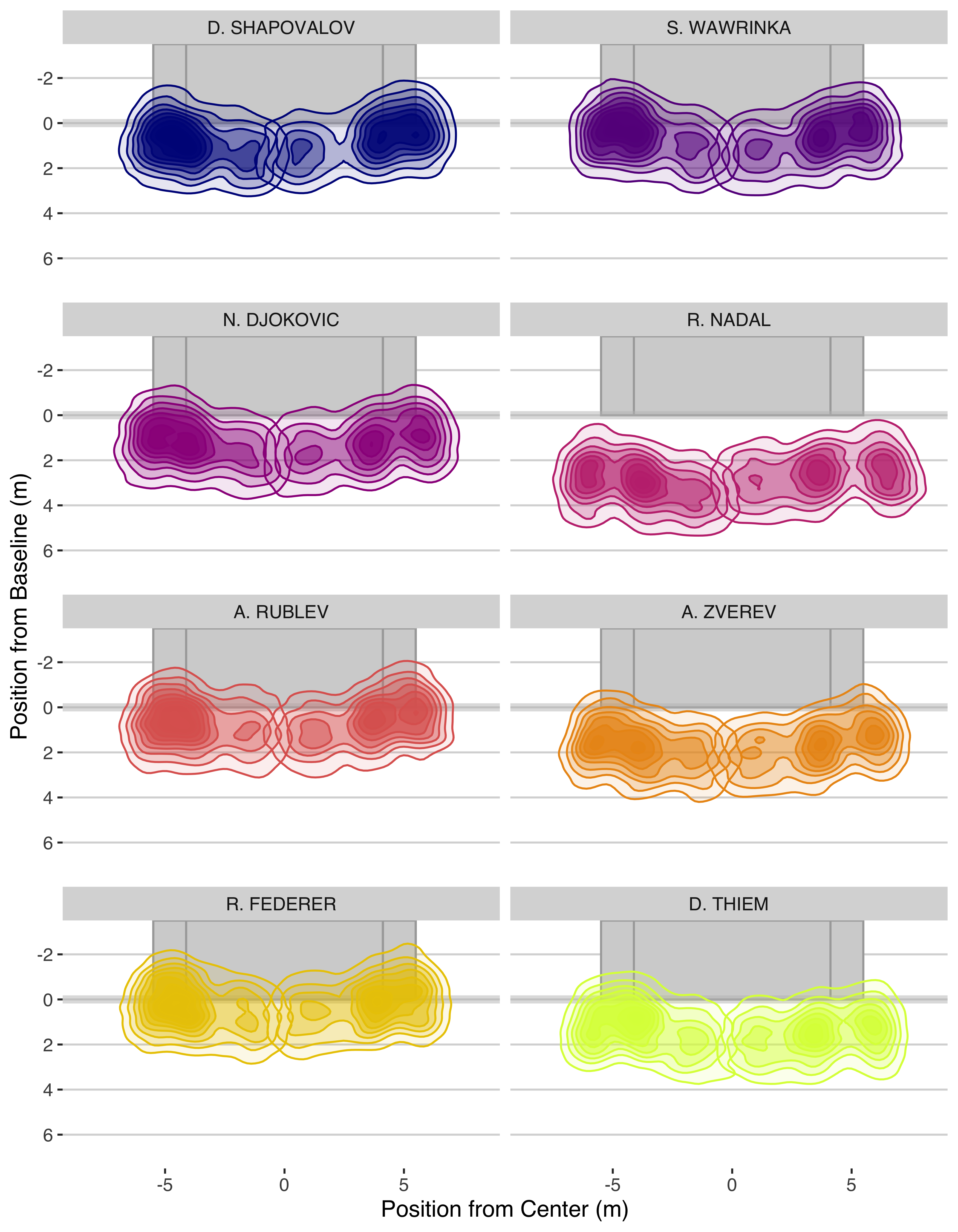
The standardized scale has been a good tool for making like-for-like comparisons across the depth and lateral dimensions of impact. But it loses the connection to the actual position of players. So I’ve selected one player from each style cluster and mapped a map of their expected impact position for first serve returns on hardcourt. The darker and more concentrated contours indicate the regions of the court with the greatest chance of being the position of the ball at impact.
It’s clear from these that the lateral variation is much more narrow than depth. Though I do think we can see a player like Nadal having to cover more area along the width of the court than a player like Federer of Djokovic. Federer is interesting in how close he stays to the baseline and shows a strong symmetry in his impact on Ad and Deuce. Contrast that with a player like Thiem who in addition to being deeper back in general is also clearly more centrally positioned on the Deuce side.
For finer grained exploration of individual players, the Return Impact Map is your best option. I hope these style summaries show that there is a fascinating variety of impact patterns worth exploring and point to some of the main ways player’s differentiate themselves in the way they approach the first serve return.